Mastering Color Management: The Key to Achieving Print Perfection
The Key to Achieving Print Perfection
In the world of digital and print design, color is not just a visual element; it’s a crucial part of communication. Whether you're creating vibrant posters, intricate packaging, or high-impact marketing materials, ensuring your work is in the correct color space is essential. The color space you choose directly impacts how your design will appear on different screens and in print, making it vital to understand your intent and how color management tools can help you achieve it. From graphic designers to print shops, navigating the complexities of color management is a critical skill that can make or break a project. In this blog, we’ll explore why being in the correct color space matters, the tools available to manage color effectively, and the challenges print shops face in delivering consistent, high-quality results.
Why Being in the Correct Color Space is Important
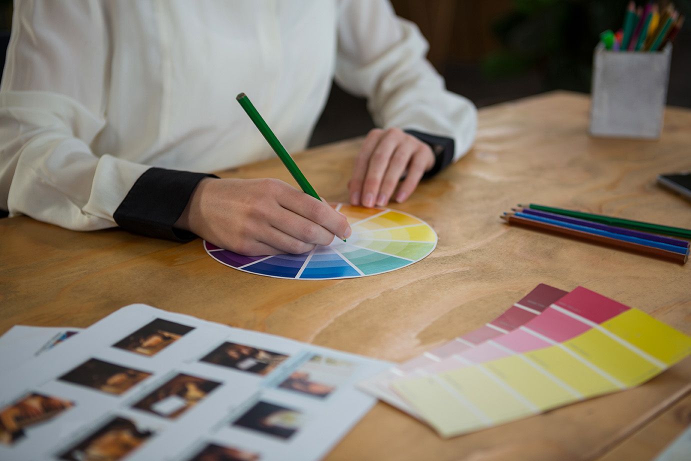
Color spaces are the foundation of how we perceive and reproduce color in digital and print formats. A color space defines the range of colors that can be displayed or printed, and choosing the right one ensures that your design looks its best across all mediums. For instance, working in sRGB might be ideal for web content, but for high-quality prints, Adobe RGB or even ProPhoto RGB could be more appropriate due to their broader color gamuts. Understanding your project’s intent—whether it’s to be viewed on a screen or printed on paper—will guide your choice of color space, ensuring that your colors remain consistent and vibrant.
Color Management Tools: Keeping Your Colors in Check
To navigate the complexities of color management, several tools are available that help ensure your colors are accurate and consistent. Software like Adobe Photoshop, Illustrator, and InDesign offers robust color management settings that allow you to preserve embedded profiles, convert to a working space, or discard profiles based on your needs. These tools give you control over how colors are managed throughout the workflow, helping to prevent color shifts that could lead to unexpected results.
Challenges Print Shops Face in Color Management
For print shops, color management is both an art and a science. The challenge lies in maintaining consistency across different devices, materials, and processes. A file might look perfect on a designer’s monitor but could print with noticeable color discrepancies if not managed correctly. Print shops often deal with files from various sources, each with different embedded profiles. Deciding whether to preserve, convert, or discard these profiles can be a complex decision that impacts the final product’s quality. Additionally, the transition from RGB to CMYK for printing introduces further challenges, as the conversion process can result in color shifts if not handled carefully.
Preserve, Convert, or Discard: Which Color Management Policy is Right for You?
When it comes to setting color management policies, one of the most crucial decisions is whether to preserve embedded profiles, convert to a working space, or discard profiles altogether. Each option has its advantages and disadvantages, depending on the nature of the project and the desired outcome. Preserving embedded profiles is often the safest bet, especially when working with files from multiple sources, as it maintains the original color intent. Converting to a working space can provide uniformity across all files, but it may result in color shifts. Discarding profiles simplifies the workflow but at the cost of potential color accuracy.
Conclusion: Making the Right Choice for Your Projects
Ultimately, mastering color management requires a deep understanding of your project’s goals and the tools at your disposal. Whether you’re a designer or running a print shop, making informed decisions about color spaces and management policies is key to delivering high-quality, consistent results. By carefully considering your color management strategy, you can overcome the challenges of color consistency and ensure that your designs look as stunning in print as they do on screen.